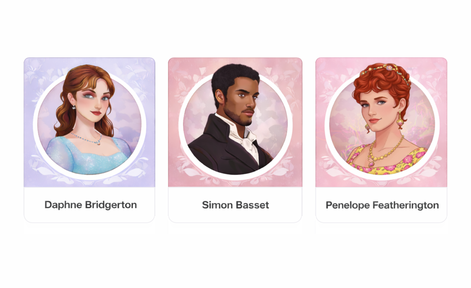
What Would Bridgerton Characters Look Like As Design Systems?
Design Insights|Feb 02, 2026|By. Zaina Rafique
Design systems shape how a product looks, feels, and communicates. Beyond consistency, they carry a distinct personality through colour, typography, and visual tone.
Bridgerton offers a cast of characters with clear identities and visual styles. In this article, we explore what these characters might look like as design systems, translating their traits into typography, colour palettes, and overall aesthetic direction.
Anthony Bridgerton: The Structured Traditionalist
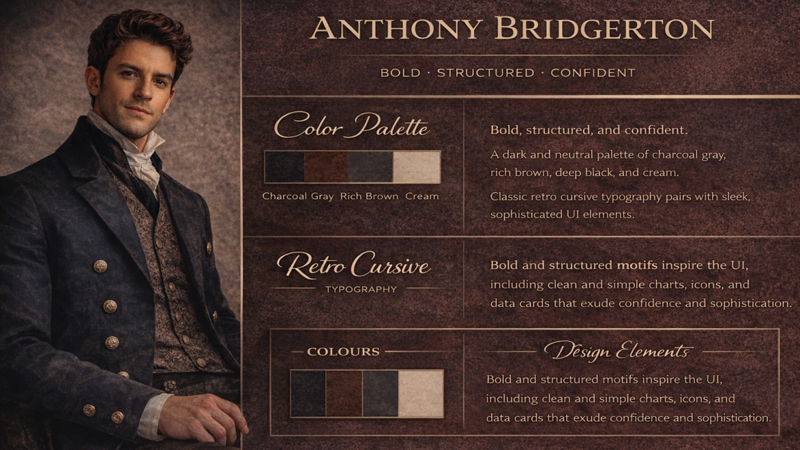
Design Personality: Bold, structured, confident
Typography: Retro cursive typography
Colour Palette: Gray, black, brown
Anthony Bridgerton’s design system is rooted in discipline, hierarchy, and tradition. It has structured grids, firm margins, and layouts that feel deliberate and controlled. Retro cursive typography adds subtle softness, reflecting the emotional depth beneath his rigid appearance.
The neutral palette grounds the system in reliability and authority, making it ideal for editorial platforms, heritage brands, or leadership-driven interfaces.
Daphne Bridgerton: Timeless Romance
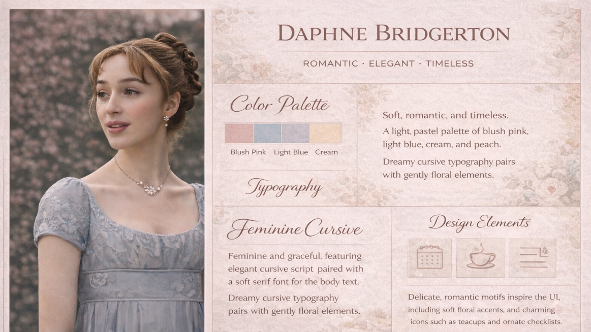
Design Personality: Romantic, elegant, timeless
Typography: Feminine cursive fonts
Colour Palette: Light tones, soft hues
Daphne’s design system is built on grace and emotional warmth. Soft, airy layouts paired with flowing cursive fonts evoke romance and classic beauty. Light pastel tones of blush, ivory, and powder blue, create a calm, inviting visual experience.
This system works beautifully for lifestyle brands, wedding platforms, luxury blogs, and storytelling-driven designs.
Kate Sharma: Modern Strength Meets Elegance
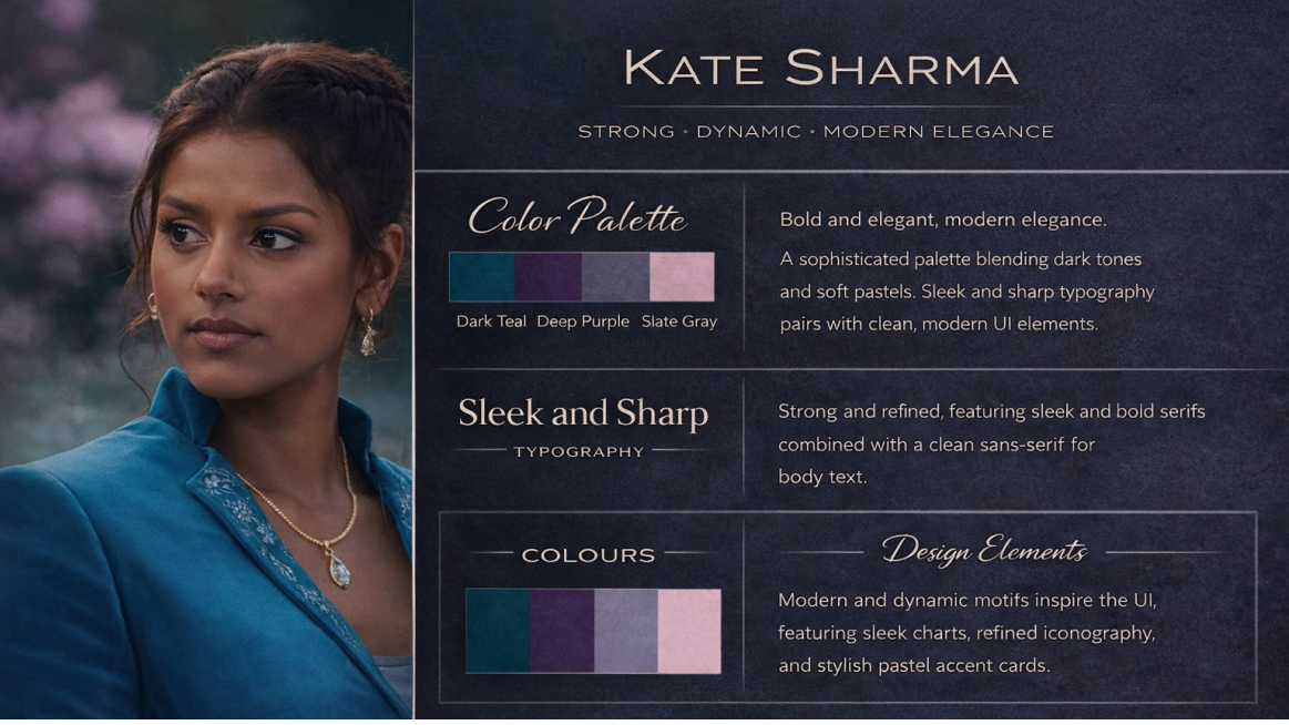
Design Personality: Strong, dynamic, modern elegance
Typography: Sleek, sharp typefaces
Colour Palette: Dark strong tones with pastel accents
Kate Sharma’s design system balances power and restraint. Clean lines, sharp typography, and confident spacing define the foundation, while unexpected pastel accents soften the intensity, much like Kate herself.
This system suits best for modern product design, premium SaaS platforms, and fashion-forward brands that value confidence without excess.
Lady Portia Featherington: Bold, Bright, Unapologetic
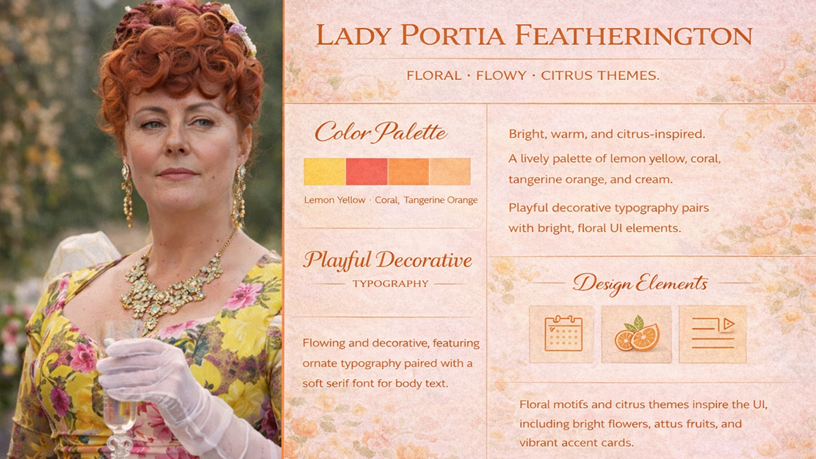
Design Personality: Flowy, expressive, dramatic
Design Elements: Florals, ornamental details
Colour Palette: Citrus themes, bright warm tones
Portia Featherington’s design system is a maximalist dream. Florals, decorative patterns, and playful motion dominate the interface. Citrus yellows, corals, and warm pinks ensure the design never fades into the background.
Perfect for creative studios, event branding, or fashion campaigns that want to be seen, remembered, and talked about.
Simon Basset: Refined Masculinity
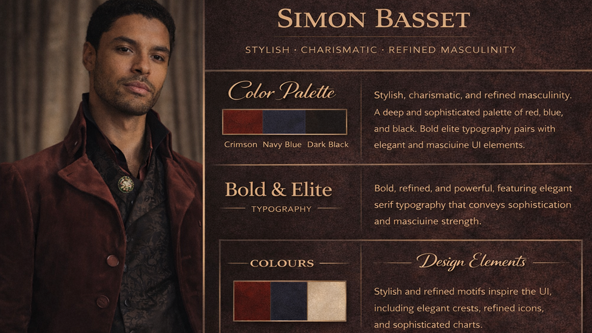
Design Personality: Stylish, charismatic, powerful
Typography: Bold, elite typography
Colour Palette: Red, blue, black
Simon’s design system shows confidence and restraint. Strong serif or high-contrast typefaces paired with deep reds and midnight blues create a sense of luxury and depth. Minimal but impactful layouts allow the content to command attention.
This system suits luxury brands, high-end portfolios, and premium editorial platforms.
Queen Charlotte: Maximalist Royalty
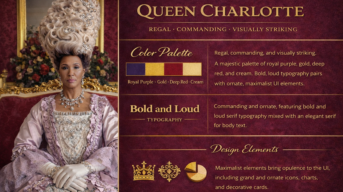
Design Personality: Regal, commanding, visually striking
Typography: Bold, loud, dramatic
Design Style: Maximalist elements
Queen Charlotte’s design system is unapologetically loud. Oversized typography, dramatic contrasts, rich ornamentation, and bold layouts define her visual language. Every element demands attention, because subtlety has no place on the throne.
Ideal for editorial experiments, high-fashion campaigns, and avant-garde design.
Penelope Bridgerton (Season 3): The Elegant Transformation
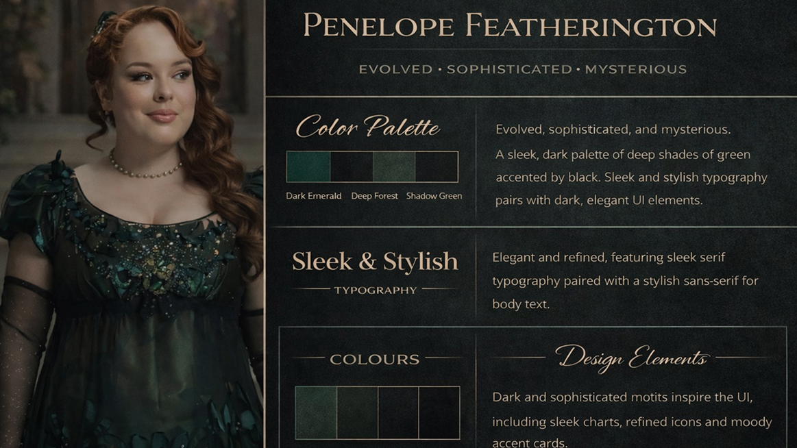
Design Personality: Evolved, sophisticated, mysterious
Design Style: Sleek, minimal, stylish
Colour Palette: Shades of green
Season 3 Penelope’s design system reflects growth and self-assurance. Sleek layouts, understated typography, and rich green hues create a sense of quiet confidence and intrigue. Negative space is used intentionally, letting the design breathe.
This system works beautifully for personal brands, editorial storytelling, and modern luxury platforms.
Benedict Bridgerton: The Artistic Free Spirit
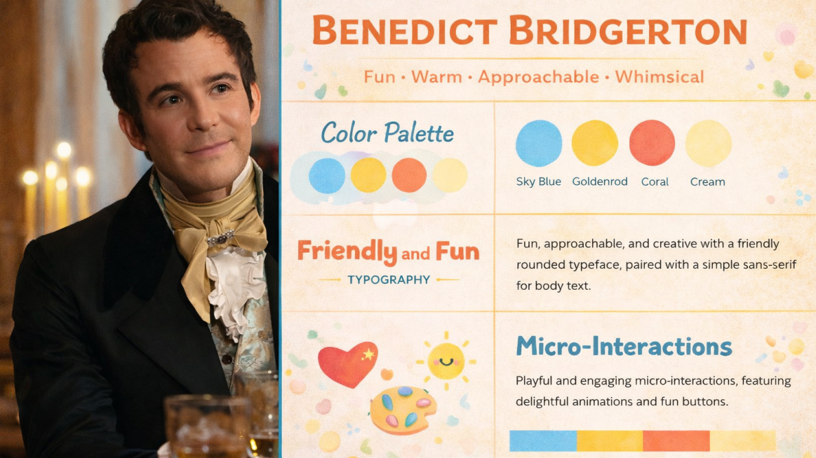
Design Personality: Experimental, expressive, unconventional
Typography: Mixed type styles, artistic lettering
Colour Palette: Muted neutrals with creative accents
Benedict’s design system is all about creative freedom. Asymmetrical layouts, unexpected typography pairings, and hand-crafted details give the system an artistic edge. Neutral bases allow experimental accents to shine without overwhelming the design.
Perfect for art portfolios, creative agencies, experimental websites, and concept-driven projects.
At the end of the day, design systems are a lot like people. They have personality, presence, and a story to tell. Looking at Bridgerton through this lens shows how colour, typography, and structure can carry character as much as they carry function. It’s a playful reminder that besides rules, design is about expression, mood, and identity.
Which Bridgerton-inspired system speaks to you the most?


Become a Mentor
Join us as a mentor and contribute towards the upliftment of the design community.

Partner with Us
Be a reason why design becomes an aspirational career path for millions of dreamers.

Become a Volunteer
Add value to the community with your vision and be a part of this transformational journey.